
Zest - Branding Suite


A Bold, Rebellious Take on Prebiotic Energy
When developing the branding suite for Zest, the goal was to create an identity that didn’t just fit into the crowded energy drink market—it needed to disrupt it. Zest isn’t just another functional beverage; it’s a statement, a lifestyle, and a rebellion against the ordinary. Rooted in skate culture, retro aesthetics, and a DIY punk ethos, the brand had to feel raw, energetic, and effortlessly cool.
Discovery & Strategy
Before diving into design, the foundation of Zest was built through research and positioning. The energy drink category is saturated with hyper-masculine, high-performance brands or wellness-focused, minimalist alternatives. Zest needed to carve out its own space—a brand that speaks to skaters, artists, musicians, and creatives who crave energy without the artificial, corporate feel.
The strategy was clear: build a brand that feels like a mixtape of vintage grit and modern edge. A nod to the ‘90s skate scene, VHS tapes, and underground zines, Zest had to embrace imperfections, hand-drawn elements, and a sense of movement. At the same time, it needed to communicate the drink’s functional benefits—clean energy, prebiotics, and a lower sugar content—without losing its rebellious attitude.
Concept Development & Design
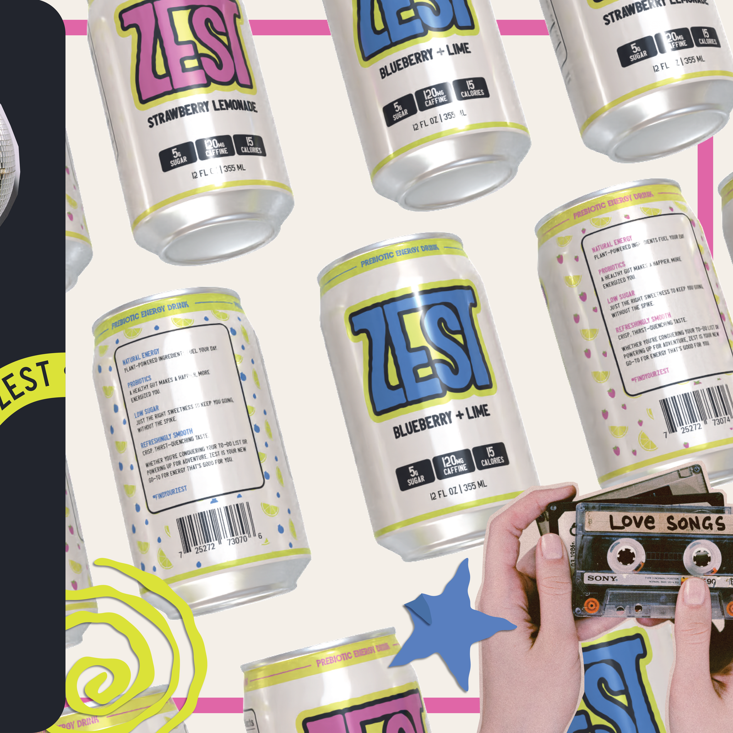
Zest’s visual identity is loud, raw, and unapologetically fun. The logo is bold and distorted, reminiscent of graffiti tags or DIY punk flyers, making it instantly recognizable. The color palette include retro tones mixed with high-contrast pops that feel like it was ripped straight from an old skate video.
Packaging plays a huge role in the brand’s impact. The energy drink cans are designed to look like something you’d want to hold onto, with hand-drawn typography, offbeat color combinations, and a rough-edged aesthetic that defies the usual polished beverage industry norms. Instead of sleek, metallic finishes, Zest embraces a slightly worn, screen-printed look that reinforces its underground roots.
Beyond the product itself, the branding extends into a full lifestyle experience. The marketing collateral—stickers, skate decks, merch, and social media assets—feels like a collection of cut-and-paste zines, grunge textures, and distorted photography. The tagline "Find Your Zest" acts as both a call to action and an invitation to be part of something bigger than just a drink—it’s about self-expression, energy, and movement.
Delivery & Production
Once the designs were locked in, the next step was bringing Zest to life across multiple touchpoints. Packaging production focused on high-quality, sustainable materials, ensuring that the brand’s eco-conscious consumers would resonate with the product beyond its aesthetic. The can designs were refined to maintain their gritty, retro feel while ensuring legibility and strong shelf presence. Zest isn’t just marketed as a drink it’s an attitude. The visuals embrace the energy of live music, late-night skate sessions, and DIY creativity, making it feel like a brand that’s been around for decades rather than a newcomer.
The Zest Impact
From concept to execution, Zest’s branding successfully bridges the gap between functionality and culture. It’s a prebiotic energy drink that doesn’t feel “healthy” in a sterile, wellness-focused way—it feels alive, rebellious, and authentic. The final outcome is more than just an energy drink; it’s an anthem for those who move fast, think big, and refuse to blend in.